Posted by Gregory Monte.
For graphs showing the physical gold & silver premiums as well as the current physical gold/silver ratios compared to spot, please go to my website: http://www.didthesystemcollapse.org.
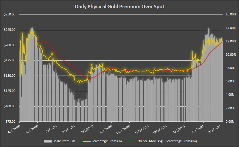
I have added a couple of new charts to my website that may be of interest to readers. First of all there is the standard Daily Gold Premium Chart:
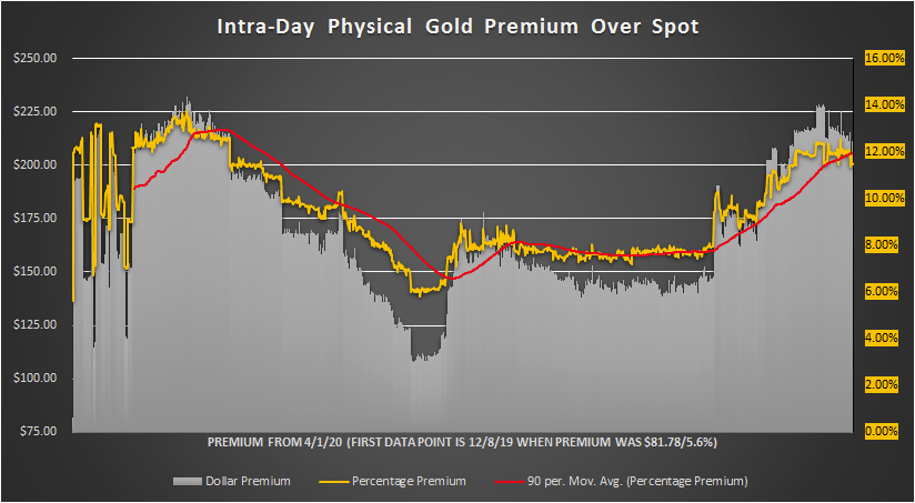
But now I also include an intra-day Gold Premium Chart so you can see the changes throughout the day. This chart also includes includes a first data point of 12/8/19 when I purchased an American Gold Eagle at a premium of $81.87/5.06%.
Because this chart has many more data points, I increased the moving average to 90 periods so you can see a different perspective:
Then, of course, there is the standard Daily Physical Silver Premium Chart:

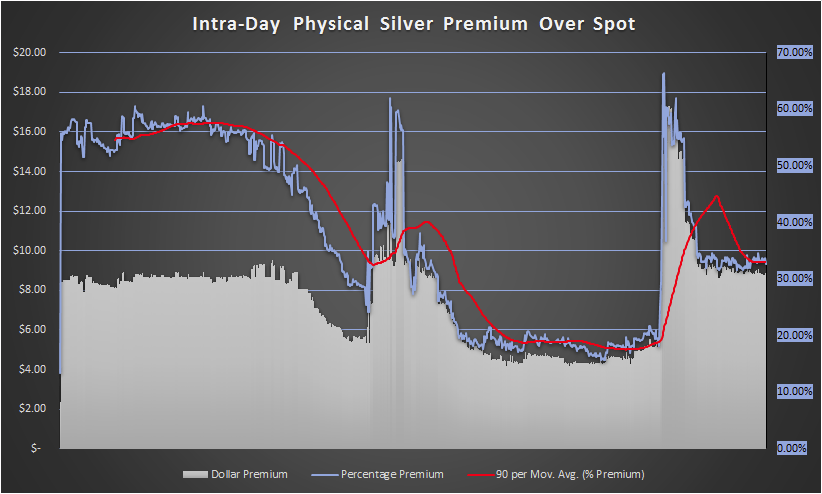
But now I also include an intra-day Physical Silver Premium Chart for anyone who wants to see what is going on throughout the day. This chart also includes an early data point (8/26/19) when I purchased an American Silver Eagle at a premium of $2.38/13.47%.
Again, I increased the moving average to 90 periods because it was more appropriate for a chart with more data points.
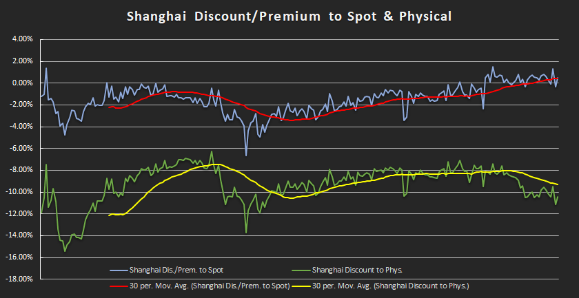
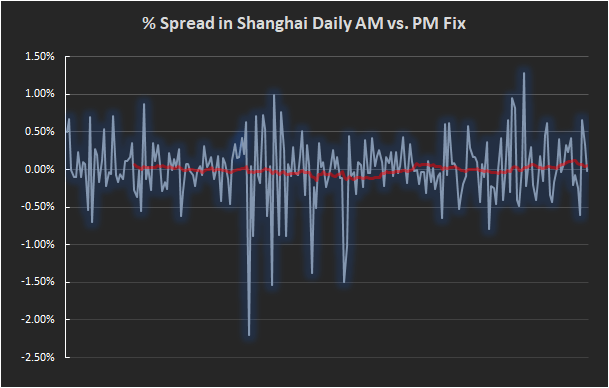
Finally, I updated the Shanghai Gold page of my website to include two other charts as shown below: