
Posted by Gregory Monte.
For graphs showing the physical gold & silver premiums as well as the current physical gold/silver ratios compared to spot, please go to my website: http://www.didthesystemcollapse.org
All Charts Updated 12/15/20 @ 8:00 PM EST

This chart shows the physical silver premium over spot based on the prices from GoldPrice.Org and the Ebay Dealer Price for a roll of 20 Silver Eagles (selling in quantities of more than 10). The first data point is my last purchase of a 20 roll of Silver Eagles back in August of 2019 when the premium was only 13.47%.
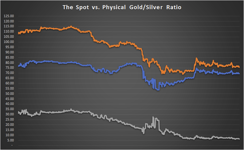
Rather than simply dividing the spot prices of gold and silver, my ratio is based on the physical gold and physical silver prices from Ebay – thus it is a “physical” ratio. The orange line is the spot ratio, blue is the physical ratio and grey is the difference between the two.

