
Posted by Gregory Monte.
For graphs showing the physical gold & silver premiums as well as the current physical gold/silver ratios compared to spot, please go to my website: http://www.didthesystemcollapse.org
Physical Gold and Silver Premium Charts – 12/16/20 @ 7:45 PM EST
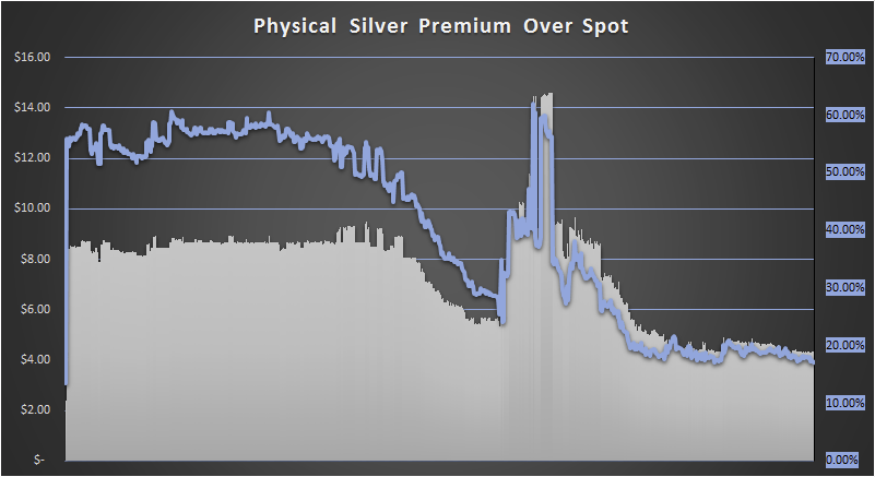
This chart shows the physical silver premium over spot based on the prices from GoldPrice.Org and the Ebay Dealer Price for a roll of 20 Silver Eagles (selling in quantities of more than 10). The first data point is my last purchase of a 20 roll of Silver Eagles back in August of 2019 when the premium was only 13.47%.
LAST GRAPH UPDATE: 12/16/20 @ 7:45 PM EST.
Spot Silver Price (ounce) – $25.29
Physical Silver Eagle Price (based on a 20-coin tube on Ebay): $29.62
Current Premium: $4.33/17.10%
DBS Coin is the lowest price dealer selling in quantities of more than 10.
Graph Start Date – April 6, 2020.
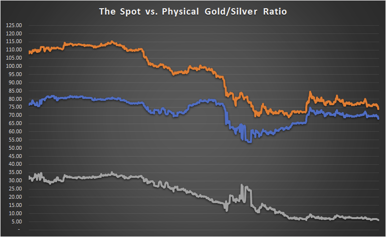
Rather than simply dividing the spot prices of gold and silver, my ratio is based on the physical gold and physical silver prices from Ebay – thus it is a “physical” ratio.
The orange line is the spot ratio, blue is the physical ratio and grey is the difference between the two.
Notice that the these two ratios have been converging slowly. This is easiest to see in the grey line. It hit a high of over 35 on 5/5/20 and has since declined to about 7.00.
What this means is that there is a very low physical premium over spot – and that means that the system has not collapsed … yet.

Graph Start Date – April 6, 2020.
NOTE: The spot gold/silver ratio is higher than the physical gold/silver ratio – but the trend appeared to be moving downward until silver and gold started spiking toward the end of July/early August. After a huge increase in physical silver premiums in early August (which spiked the percentage premium to all times highs near 150%), the premium has settled down below 111%. It is now at close to the lowest premium since I started keeping track of the ratio. See recent developments on my website for more details.
