Posted by Gregory Monte.
For graphs showing the physical gold & silver premiums as well as the current physical gold/silver ratios compared to spot, please go to my website: http://www.didthesystemcollapse.org
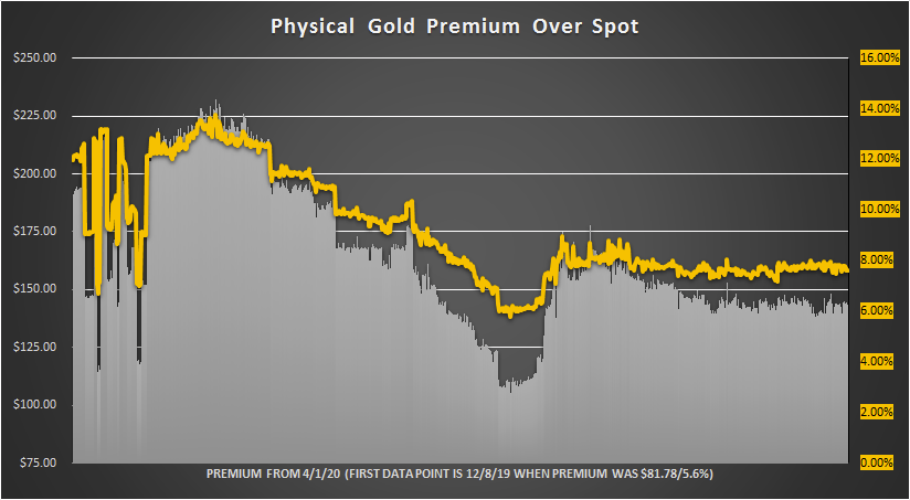
All Charts are Updated 12/17/20 @ 8:15 PM EST
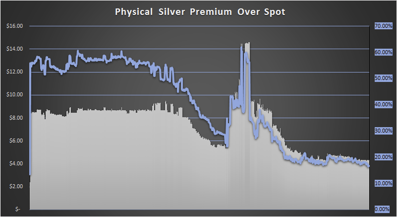
This chart shows the physical silver premium over spot based on the prices from GoldPrice.Org and the Ebay Dealer Price for a roll of 20 Silver Eagles (selling in quantities of more than 10). The first data point is my last purchase of a 20 roll of Silver Eagles back in August of 2019 when the premium was only 13.47%.
LAST GRAPH UPDATE: 12/17/20 @ 8:15 PM EST.
Spot Silver Price (ounce) – $25.82
Physical Silver Eagle Price (based on a 20-coin tube on Ebay): $30.16
Current Premium: $4.34/16.80%
DBS Coin is the lowest price dealer selling in quantities of more than 10.
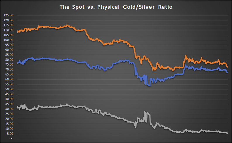
Rather than simply dividing the spot prices of gold and silver, my ratio is based on the physical gold and physical silver prices from Ebay – thus it is a “physical” ratio.
The orange line is the spot ratio, blue is the physical ratio and grey is the difference between the two.
Notice that the these two ratios have been converging slowly. This is easiest to see in the grey line. It hit a high of over 35 on 5/5/20 and has since declined to about 7.00.
What this means is that there is a very low physical premium over spot – and that means that the system has not collapsed … yet.
LAST GRAPH UPDATE: 12/17/20 @ 8:15 PM EST
- Spot Gold/Silver Ratio: 72.87
- Physical Gold/Silver Ratio: 67.15
- Spot Minus Physical Ratio: 5.72

This chart shows the percentage premium of the spot vs. physical gold/silver ratio.
